Michael Hardings
An website add-on that enhances MH’s first-time buyers’ shopping experience
PREVIEW
Project Overview
🖌️
MH's shopping guide is a website add-on that makes shopping a breeze for customers, helping them find the products they want and fine-tuning their preferences as they go. It gives personalized recommendations based on customer choices, making the selection process more efficient, and enabling them to easily sift through loads of information to find precisely what they're looking for.
The Goal
💪
In this project the goal is to enable first-time Michael Hardings customers to easily filter products, enhancing the user shopping experience and boosting online sales.
Process
🚀
Duration
8 Weeks
Tool
Figma
Deliverables:
User Research
Design System
High-fidelity Prototype
My Role:
UX Researcher
Designer
Project Proposal
UNDERSTAND
Customer Challenges:
1. Lack of understanding of product offering: Not sure which product to choose based on the current product guide. The product guide contains lots of professional information but can overwhelm first-time buyers.
Business Challenges:
1. Struggle to appeal to the group of artists students due to its complex product offering
2. Keeping People Interested: make sure people keep coming back. We do this by providing valuable information, encouraging users to share their thoughts, and offering extra services to keep them engaged and interested.
Target Audiences
UX RESEARCH
Art students and beginner painters
Who are new to MH's products and require guidance in selecting the right colors and qualities. They seek clear recommendations and a streamlined shopping experience.
Over 70% of existing customers purchase paint sets rather than individual paints at Michael Harding's.
“Michael Harding’s complete paint sets perfectly suit my artistic needs, rather than buying individual tubes, I prefer getting sets.”
Design Opportunity
I interviewed both first-time buyers and returned buyers of MH to see what they think needs to be improved and keep from the current shopping process. During this process, we narrowed down the design opportunities that could help me with my further steps.
From the design opportunities I discovered above, I interviewed 7 new users (our target audiences) to get a more precise answer on which functions I should focus on most. I used this comparison table to see which functions are most needed for new users.
Here are the top four functions that are needed from new users:
Efficient filters that guide users to figure out what they want
Efficient and friendly purchasing process
Give out product suggestions
Clear and easy onboarding navigation and category
THE SOLUTION
A website add-on that empowers first-time buyers to make the right decision and purchase with confidence
Information Architecture
Based on the user testing, users from MH think their current navigation is too complex and confusing, they are looking for Clear and easy onboarding navigation and category. therefore, I have changed the IA to a simplified and clear one for any users.
Design principles
Iterations
Option Explorations
To assist users in securing their desired items and crafting their ideal oil paint set, it is imperative to experiment with various approaches to determine the most effective method for posing questions and providing guidance, enabling users to make informed and confident decisions.
We are providing 2 options for users to experience and choose which one they prefer.
Option 1 allows users to have more freedom during the process.
Pros: Option 1 allows users to upload their images, and compare and adjust product qualities. Users get to have more control over making decisions.
Cons: option 1 requires users to fully participate in the process, it does not give the users an answer instead it gives out multiple potential answers and needs users to make the final decision.
Option 2 guides users to make confident decisions.
Pros: Option 2 gives out the best-matched decision based on the questions the user answers along the way. Doesn’t not require much thinking during the process.
Cons: Option 2 has less freedom for users to explore and compare different products.
“Option 2 increases the limitations and based on the answers it gives out specific recommendations, this decreases my thinking process”
“ I liked option 2 - step 3 (adjusting product details) as I was able to choose quality and its specific level. This would help me to get the paint that better matches my needs and requirements.”
Wireframe
Design
Design System
Design
Interface Breakdown
1. Set expectation
This step, clarifies the target audience and purpose of the add-on, providing customers with an understanding of what to expect and helping them make an informed decision about proceeding.
2. Select color style/painting
In this step, customers can choose a painting style that aligns with their preferences and needs by selecting a color style, which helps refine their options.
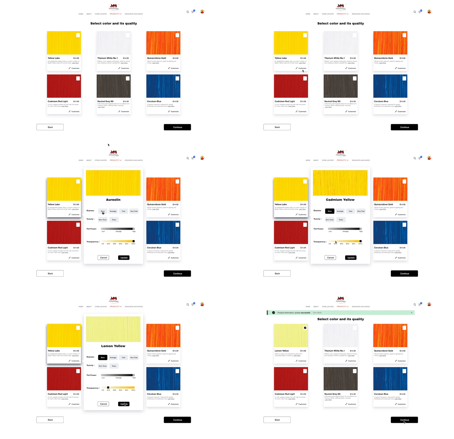
3. Select color & adjust details
In this step, customers can fine-tune each recommended color by selecting its specific qualities. These adjustments will result in corresponding changes to the color recommendations.
4. Final color set review
In this step, customers have the chance to add, adjust, or remove product details, allowing them to review their choices before proceeding to the checkout.
Demo Video
Impacts
The initial user workflow was confusing, prone to errors, and time-consuming. To address this, this project offered a customized and effective solution, enhancing their shopping experience.
The website add-on personalizes the shopping process for new user groups and artist students, emphasizing paint sets. Over 70% of Michael Harding's existing customers prefer sets, underlining the market demand. This innovative feature benefits both potential and current users.
The new add-on delivered advantages to potential and existing users, facilitating the team in pinpointing user pain points, product prospects, and user personas for online sales and new user groups.
Takeaways
Finding the correct user for testing and asking the right questions helps the projects to have a solid starting foundation
What questions are asked during the process is crucial for both the client and users. A good question list must allow the users to give answers confidently and make the right choices
Exploring design options widely helps keep design critique sessions efficient and engaging.


